Typography
Typeface Design
Process Display Typeface
In 1972, Letraset International, a dry-transfer typeface company, conducted and international competition to generate 18 new display typefaces to add to its ‘Letragraphica’ range of display faces. The competition attracted approximately 2,590 entries from 43 countries. Process, a typeface designed and submitted by John Reid, was one of the 18 typefaces selected. It was released internationally in 1973. The design was inspired by photo-processing, a printmaking technique that enabled the impression of tone with the use of black ink. Process exploited the dry-transfer application of letters to enable their overlap effectively making a whole word into a logotype.
For example:

Process:
Selected design steps, competition entry and publication

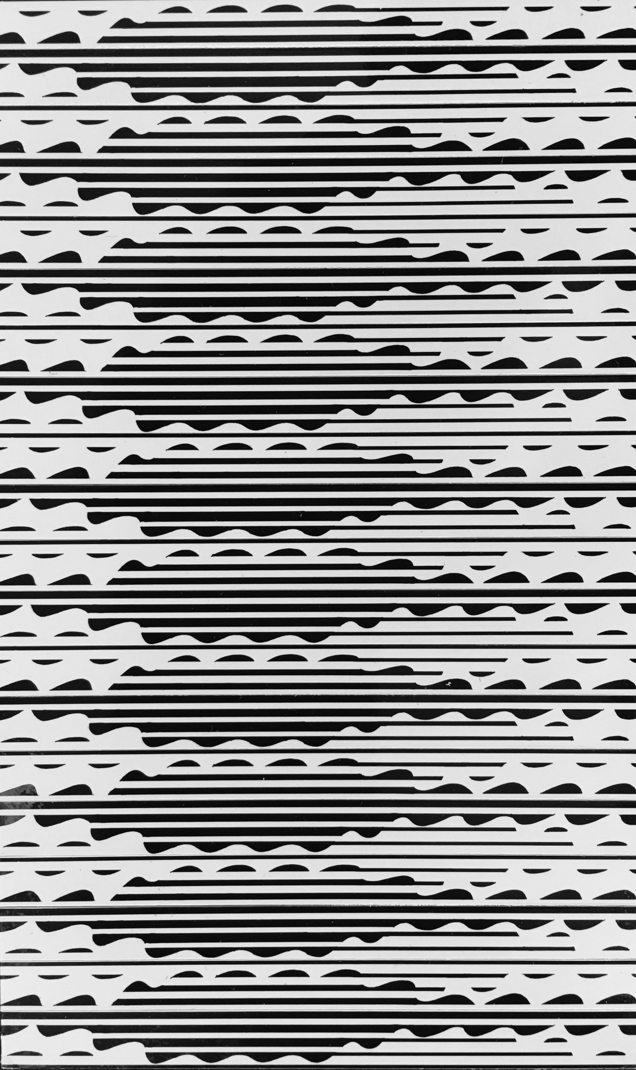
Analysis of a photo processed image printed in a newspaper

Analysis of transition between black and white

Negatives of pen and ink basic shapes used for mass production
Test application of basic shapes on grid

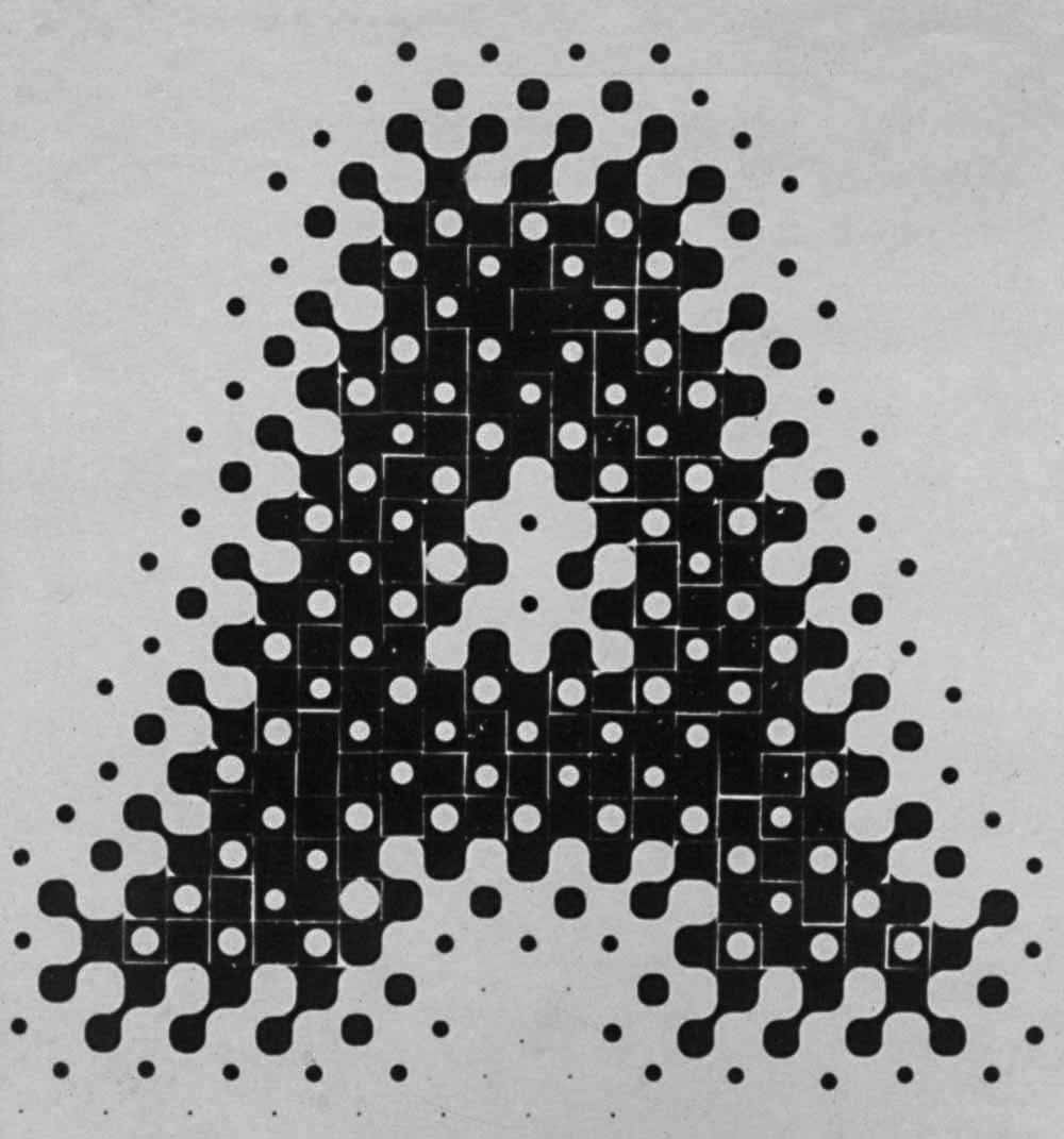
Final artwork for 'A'


Complete font with background dot


Complete font without background dot
Letraset International Display Typeface Competition

Detail of pamphlet listing 20 selected designs


Letragraphica promotional document for Process

ANU Reporter article

Examples of display typeface applications


Video Display Typeface:
Selected preliminary design steps
A preliminary design for a display typeface indicative of video was undertaken in the mid to late 1970s. It began with a felt pen weaving cartoon as part of a tapestry weaving workshop convened by the Crafts Council of Australia and conducted by Scottish weaver Archie Brennan at the University of New England, Armidale NSW. The woven cartoon brought the felt pen sketch to life as a more vibrant graphic rendering of alphabet characters as they appear on a video monitor. Later, back on the drawing board, the rough notional designs for the letters ‘I’ and ‘T’ took shape - basic forms from which other characters, numerals and incidental characters could easily be developed.