Early Encounters with Photography (1950s – 1980s)
John Reid
This autobiographical note was written in response to my son, Kai Wasikowski, making plans for us to a chat about my early experiences with the camera while he was at the Rhode Island School of Design in the US. The note was drafted to stir my memory and set the foundation for our discussion.
JR 29.1.2023

Self Portrait entering an overhang in harness, Budawang Range, Morton National Park NSW. Circa 1980s
Dulcie, my mother, castigated my old man for buying a Kodak colour slide camera as he unpackaged it on the kitchen table in our Townsville home in the mid-fifties. “Mick, why did you buy that?”
This incident was to mark a turning point in photographic documentation of our provincial life in Queensland. Until then our family pictorial history was secured in several formidable photographic albums full of black and white Box Brownie snaps pasted on durable paper between sheets of delicate tissue and reaching back before I was born – 21 March 1948.


Top Family home in Pimlico, Townsville, where I lived for the first 10 years of my life. (Photograph Mick Reid, circa 1950). My brother, Peter, and I shared the left side of the house as our communal bedroom. The room at front and centre was the main bedroom for my mother, Dulcie, and my father, Mick. Behind it, was an internal room used as a bedroom for my elder sister, Lynette.
Bottom (Photograph Google Maps, circa 2022). The fence, the palm trees, the temporary shelters and the house at the back are relatively new additions. The casements enclosing the room to the right were installed by my carpenter grandfather, Edgar Holmes, well before the Reid family moved to Toowoomba in 1958/9. Once enclosed, it was occupied as a bedroom by Lynette.
These folios were augmented by exotic pictures in National Geographic magazines stored in a bookcase with glass doors on our louvered veranda. Their honey coloured spines shone in the afternoon sunlight like beacons to faraway places. Hours were spent daydreaming over their pictorial contents. A Bakelite contraption, held to the eyes like binoculars, competed for attention with these fascinating journals. Branded ‘The View Master’, a side lever rotated a cardboard disc of photographic stereo pairs arranged on its perimeter to deliver through the eye wonders of the world in mind boggling realism. Such was the extent of the photographic medium’s influence on my childhood until illuminated colour transparencies, generated by Mick’s new camera, won over everyone’s attention.
Happy hours were spent viewing colour soaked images of holidays on Magnetic Island lit up on a screen made of a rigid sheet of Masonite painted white with a neat black border and propped on a chair. Using a sliding device (hence the name ‘slides’), Mick manually fed 35mm colour positive film held in square cardboard mounts into an art deco styled projector. One in, one out.

Magnetic Island. Queensland mainland in the background. Photograph: Mick Reid
In 1958, the camera excelled in recording a seven-week family trip from Townsville to Tasmania in a Hillman Comma station wagon. It was an enlightening experience. Mick clicked away as we motored through a variety of landscapes (we drove the vehicle to the top of Mt Kosciuszko), to destination towns (the shower block at Melbourne’s Brunswick Caravan Park was a hit escaping heat and flies) and infrastructure of national importance (the Snowy Mountain Scheme was hard to beat). Dulcie maintained a comprehensive journal recording in detail the subject matter of each photograph taken. Image and text from this excursion entertained slide-night guests for months (maybe years?) after. Adults sat in lounge chairs, kids lay on the floor with pillows, as Mick slid his pictures through the projector and Dulcie, torch in hand, read from her notebooks.
A decade later in Toowoomba, and then in Brisbane, Mick and Dulcie (now armed with her own slide camera) were established amateur photographers and keen participants in the extensive camera club scene. Field trips on weekends were common. My elder sister, Lynne, was a favourite model and was required to attend and to wear a red garment (a compositional element that heightened competitive success). Under the pretext of looming homework deadlines, I managed to escape these photographic forays in favour of a TV mid-day movie, a bottle of Coke and Welsh Rarebits sizzling under the griller just in time for the opening credits. Peter, my younger brother, also dodged these questionable adventures by capitalising on my crime of deceit. Despite us, material was gathered on these trips to the Darling Downs west of Toowoomba or to the Sunshine Coast north of Brisbane for entry into inter-town camera club competitions as well as national and international gatherings of camera enthusiasts. The short (3 minutes?) ‘audio-visual’ emerged as a popular category requiring a vocal script and music as taped accompaniment. ‘Table-top’ photography was another quirky field of endeavour that exemplified the pervasive appeal of kitsch. Mick was regularly recruited to judge in these events. The expanse of enamel on the side of our oversized kitchen oven in Brisbane (the one commissioned to melt cheese on weekends) was a convenient surface for previewing projected entries and family passers-by would throw in their opinion if Mick faltered in his judgement.
My first camera was a 35mm Minolta courtesy of Dulcie making a duty-free purchase returning from New Zealand. Still in its box, it went with me to Canberra when I began my illustrious academic career as an ANU undergraduate in 1966. I have black and white pics of random moments of student life – snaps for Woroni, the student newspaper; documentation of a trip to Thailand on a Thai-British Archaeological Expedition as an assistant to one of my lecturers, Dr Helmut Loofs-Wissowa; and portraits for various publications of notable folk knocking about the ANU.
I worked part-time in the later stages of my undergraduate scholarship as a graphic design assistant in the ANU Architecture/Design Section. It was a period in graphic design history when photographs were in vogue replacing hand drawn illustrations to accompany passages of printed text. In league with the Visual Aids Unit at the ANU, I was engaged in producing images to meet the University’s printed identity. I was working as an assistant to David Walker, the University’s Graphic Designer and an accomplished metalsmith, who came to the post from an academic creative art background in WA, and the UK before that. Consequently, I was immersed in a milieu of professional designers. In the midst of designing a book jacket for ANU Press titled, Land between Two Laws, I hit on an idea for creating a display typeface indicative of the photo-processing technique that enables the impression of continuous tone through the use of black ink only – as in reproductions of photographs in newspapers and magazines. David drew my attention to an international display typeface competition run by Letraset, a British company that made a range of typefaces available as dry transfer (rub-down) lettering and that dominated the market prior to the more convenient ‘photosetting’ process, and subsequently, the advent of computers.
I set to work creating my entry which initiated a love affair with copy cameras. The best of them were big machines that ran on horizontal rails and were perfect for making precision copy negatives of 2-dimensional artwork. Unlike handheld cameras with a lens system anticipating a predilection for objects in space (such as figures in landscapes), copy cameras, or process cameras, have a lens arrangement for delivering optimal results for reproducing two dimensional surfaces without distortion – an indispensable tool in cartography and indeed for my quest. Eventually I figured out how to implement my design. I drew several basic shapes with pen and ink on drafting paper, then made negatives of them for mass contact printing to cut-up and assemble into alphabet characters and numerals. Called Process the entry came in the top 10 in a field of 2,700 from 43 countries and was marketed internationally as part of Letraset’s Letragraphica range. I received a royalty of one English penny for every sheet sold. Display typefaces have a very limited application so riches eluded me although I did enjoy 15 minutes of fame when all the moments in the graphic design spotlight were aggregated.

Pen and ink drawing on the ground, Woden, ACT, circa 1967, documenting suburban development for an ANU Art Club exhibition. Photograph: Unknown student colleague using my Minolta.

Arising out of this enterprise, I formulated a proposal for an ANU Creative Arts Fellowship to apply to black and white television the method I had devised for the print medium. A photographic, static analysis of the electronic medium resulted in drafting another ‘alphabet’ of basic shapes to mass produce and assemble into large 2D images indicative of the medium’s visual characteristics and, in television’s case, optical impact on the viewer. The Fellowship application was successful and led to a three-year investigation (1977-79) involving process cameras as tools fundamental to the task. The outcome was exhibited in the Canberra School of Art Gallery in 1981 under the title, From the Armchair – An Essay in Medium Detail.

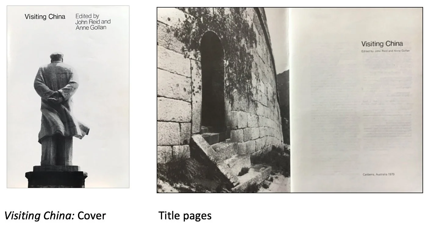
At the beginning of 1978, I joined the teaching staff at the Art School encouraged by the Director, Udo Sellbach, to apply as a member of the Visual Communication Workshop. Later that year my 35mm Minolta with its humble but high quality fixed lens assumed manual prominence on a three-week trip to China. This marked my first compilation of photographs taken with the eye of an aspiring visual artist. The group I was lucky enough to join (courtesy of my relationship with Moira Scollay) consisted mainly of ANU historians breaking the ice of western visitation after Mao’s death and the fall of the Gang of Four. I took hundreds of photographs as the curious contingent was carefully guided through the country. A couple of dozen of these black and white photographs were selected to be included in a booklet, Visiting China, published privately by the group on return to Australia.
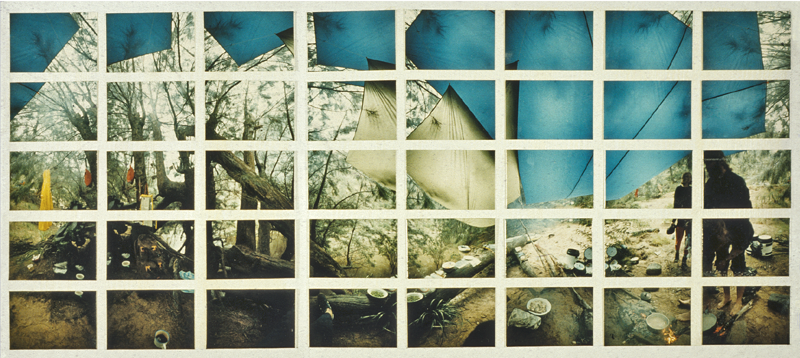
The Visual Communication Workshop consisted of three streams, Graphics, Audio Visual and Photography. By 1980-81 the photographic medium assumed prominence and the Visual Communications Workshop became the Photomedia Workshop. Students were recruited accordingly. Several students were keen bushwalkers and as the photographic medium is eminently suited to wanderers, it was not long before I was organising 5-day backpacking field trips into remote landscapes easily accessible from Canberra to gather photographic material for development in the context of the fine arts. Now equipped with a 35mm Canon and interchangeable lenses (plus several canisters of Ilford FP4), I did my first hand-held photographic artwork with it – ARTEFACT.

John Reid ARTEFACT, Morton National Park NSW. (Details). 1981.
8.0 x 230.5 inches
Silver gelatine prints 8.0 x 10.0 inches x 22
[Explanatory note: 22 10x8 inch photographic prints that make up the work spell-out the word ‘ARTEFACT’ by using my body in each print to render ‘exploded’ letter parts in sequence. For example the ‘A’ in ‘ARTEFACT’ became three prints, /, –, \. Above left: Component #19 - The Upper Part of the Letter ‘C’. Above right: Component #20 - The Lower Part of the Letter ‘C’.
Both images have had currency independent of their place in ARTEFACT. As a result of the chance alignment of the body with the tree limb, Component #19 also speaks of a human/flora survival relationship. Component #20 was manipulated to accentuate the grain and was included in a series of ‘dumped body’ images as part of the work I did on political disappearances, See below.]

While on location, I began scanning spatially unusual landscape formations such as rock overhangs and cave entrances exploiting a wide-angle lens to shift the rendering of the location into an unrecognisable, slightly fantastic, but still credible scene. See cover photograph.
The scanning technique with 35mm cameras became a large part of my early photographic repertoire. It was used for many of the images incorporated into the Fishman narrative. Photograph below: Breakfast on the banks of the Shoalhaven River navigated in search of the Fishman.
Spinning off from my collage work addressing political disappearances, I produced a considerable number of single 35mm photographs such as the ‘dumped body’ image below.

There is one other aspect of my practice in the first few years of the 1980s that I should mention – a love affair with medium format plastic cameras. Banner brand cameras could be purchased from toyshops for $3.50. They were a sheer pleasure to use. A sunny day, load 100 ASA film. Overcast, 400 ASA film. Point and pull the trigger. No need to focus or fiddle with light meters. On account of the plastic lens and its imperfections, the negative made a feature of imaging light per se. The intended subject matter was always upstaged by the visualisation of light itself. The trick was to get a camera that did this well. After acquiring 4 or 5 Banners I scored a couple.
Plastic cameras (all plastic, no exceptions) became a ‘thing’ in the Photomedia Workshop. Almost everyone had one for regular good-fun in-house plastic camera competitive exhibitions (including cameras used), if not for public exhibition. I used them for both. For me, their application for public exhibitions extended well into the 1990s. (See below).

From the Community Building Series

Douglas Holleley, a visiting artist in the Photomedia Workshop in the early 80s, arranged for a showing of Les Walkling’s 10x8 inch contact prints (on loan from the NGA) in Photospace. I was gobsmacked by their rendering of detail and resolved to get a 10x8 inch format camera. Although the use of 35mm and medium format cameras continued, the 10x8 initiated a new mindset for the application of the photographic medium in my art practice.
Terror - Lest we forget
Terror. Lest we forget, was written in mid-1999 on the occasion of, and in response to, a visit by Professor Michael Taussig, Columbia University, USA, to The Australian National University in the same year. There is a considerable autobiographical element in this writing. It is also included in the section of this website, Untitled: Collage of Australian Banknotes.
Knowledge of political disappearances emerged for me from the crudely inked pages of Amnesty International's printed material in 1981. The phenomenon struck me as an alarmingly virulent form of terror, of repression. It was a blow not to the viscera, the more familiar location of shock from accounts of horror, but to the intellect. Something to be said for the editorial treatment.
The terrorist who I had previously defeated in my mind because of his or her inability to discern the enemy had now become astute – the enemy is who ever terror kills. The terrorist who I had defeated in my mind because of his or her meagre and make-shift resources now had sanctioned access to the arsenal of the state. The terrorist with whom I could conceivably argue because of the conspicuous nature of ideological passion now becomes anyone whose capacity for sadism and murder is the primary form of expression. This grim human urge surfaces in many countries with impunity and compounds in magnitude in like minded company. The terrorist becomes the system, a grotesque hydra, a pack of paramilitary thugs for every suburban block.
I resolved to deal with my anxiety by making a picture. Visual image making is my chosen medium of expression. I would need help to extirpate this monster. The picture could work for me in the recruitment of allies. Work like vaccination, a serum for my community. Work even when I'm dead and protect my children. A fascist squad requires a thousand hands to stop its deadly momentum.
A picture about disappearance can be fixed to a wall. Each mark (disappearances always leave marks) can be viewed together; collarged with other marks from stairwells, from trucks, from cells, from chambers - thousands upon thousands of them. Should the locus of terror's train emerge in the picture’s overview it may be possible to derail it and thereby exorcise my recurring dream of disappearance:-
I desperately seek the meaning of a word in a huge book. The entry refers me to several synonyms. For the meaning of these, I am referred to several more. And for their meaning, yet several again. I feverishly strike each reference from the page. There is no sanctuary; recto, verso, top, bottom. Every word is an informer. Each one is guilty. Each one disappears from the page under a lashing of ink administered by my pallid hand. The passion eventually dissipates. The inquisition is reduced to routine mindlessness.
My nightmare ends when I realise that I have blacked-out an entire dictionary, except…
One word always remains.
--------------------
Images of atrocities are impressive. Many still accompany me from childhood when I first encountered documentations of declared conflicts. By virtue of family participation in them, these histories had infiltrated our modest library. They were contained in a large bookcase with glazed doors. "Lest We Forget" was embossed on some of them. It was also the phrase that resonated at school each year in the memorial services for Australian soldiers who died in these actions. A potent motif of national consciousness, it served to reinforce the memory of death in all the portrayals of it that I had encountered:- the entrenched victim of war, the crucified Christ as a ghastly image of religion; the criminal, hung, as a perverse consequence of justice.
Artist impressions of ritualistic acts perpetrated against the individual by ancient and alien cultures also shocked my childhood sensibilities. These were secreted in perfect bound volumes of The National Geographic Magazine that were log-jammed into honey coloured blocks on the lower shelves of less elaborate cupboards in our airy Townsville home. Later, as I cruised public library shelves, seemingly more in control of my education, I would compulsively reach for the glossy compendia of more contemporary horrors rendered in scrupulous detail by light sensitive materials. I had experienced the detatchment of the professional photojournalist (lest we forget) some twenty years before. My childhood neighbor and contemporary, Rachel, was hysterical at the prospect of her father decapitating a hen with an axe. Despite the exhibition of her extreme distress as protest, she refused to leave the scene of the execution. If it were to happen, she would watch. (I didn't look. I watched Rachel instead). Rachel was a very attractive girl. Her parents were proud of her appeal.
"Terror as usual” (Taussig. The Nervous System) remained largely invisible to me during my early life in the 50's in Queensland - a state of delusion. The forced separation of Australian Aboriginal children from their parents and their protracted terrorisation at the hand of church and state did not register on my consciousness. What of our collective, grubby business in New Guinea, in Korea? Our bashings and deaths in custody. What else was there?
--------------------
Because of the detached nature of my mental conditioning to terror (and in some other respects in spite of it), I was susceptible to the chilling messages from Amnesty's journal. I knew, somehow, that editorial policy moderated the treatment of terror in the journal. It did not match reality's pathology. A line was always negotiated between a potential reader's outrage at terror's talk and their possible alienation from Amnesty International as a result of the overwhelming horror of the worst of its business. In Amnesty’s public document, the defense of non-violent expression of opinion and the rescue of those incarcerated for it has to be knight-in-shining-armor stuff.
I went to London in 1982 to the archives of Amnesty at its headquarters. I wanted to step on the other side of their editorial line so that I might ultimately draw my own. There were problems with this. My ordinariness combined with my extraordinary interest in what was going on raised the matter of security. There was a hint of suspicion. I was eventually let loose but only in the public section of their library. The information available there was considerable.
I went to Berlin. My engagement in Amnesty's office in the West of the city was confined mainly to the visual. The German campaign posters for the Disappeared had tremendous eye appeal. They were large and colourful; bold mixtures of image and text. I rolled a selection into a manageable cylinder and returned to my hotel room. It was there, staring through a window into a courtyard that resembled a mine shaft, that my process of picture production was settled. I would collage all my money. 'Guernica' came instantly to mind: that sort of scale; that sort of chronicle. My pulse rate quickened. There was a touch of sweat. My body was preparing to escape. I knew I had thought of something worth acting upon.
I returned to my power base. It is a space in the Photomedia Workshop at the Canberra School of Art where I work as a visual artist and teacher. The details of my plan could be summed up in a few words. Convert asserts to Australian bank notes, assorted denominations. Acquire acid free board, cedar moulding. Construct picture surface to accommodate bank notes (3x5m). Acquire scissors, tweezers, brush, glue, pencil, ruler, rubber. Collage bank notes. Compositionally resolve picture by pasting last banknote fragment. Estimated completion date six years hence.
--------------------
As a general proposition it is desirable strategy in the visual arts to establish a relationship between subject matter and medium. Colour as a subject begs paint. Veracity can be well served by photography; the human touch by clay. For political prisoners, it's money. The relationship is a tense one. Chomsky and Herman (Spokesman, 1979) in their two volume treatise on the political economy of human rights had elucidated the pact in words:- Foreign government aid-dollars prop regimes willing to repress their own people so as to maintain the foreign economic exploitation of them.
Not only did I want to visually express this thesis,
$$$>Political Disappearances>$$$$$$$$$
but to incorporate it as a two dimensional image with a slippery surface. The literal mind falters when it encounters a static image with a slippery surface. It's a statement with an illusive grammar. It's visual expression at its best. The optical contemplation of the static image which, if it is indeed slippery, triggers another collage - unanticipated cerebral conjunctions of personal and cultural understanding. The insight liberated by each conceptual slide can further propel the afflicted viewer into direct political action. That's what I wanted. I was confident I could get it because I had had it before.
--------------------
A clear glass jar full of unsealed condoms in a communal lubricant stood on the front steps of a typical suburban Canberra dwelling beside the morning newspaper and bottles of home delivered milk. Such was the image that, in 1969, comprised the pictorial component of a poster advertising the attributes of "family planning". If you were a milkman involved in providing the essentials for life, would you deliver contraceptives? began a passage of text reversed from the photograph. I had designed and produced the poster for publication in the university student press as a deliberate flouting of the law. Advertising of contraceptives was prohibited in five of Australia's six states and this frustrated the communication of services offered by the Family Planning Association. The lead text concluded, Disgusted at the sight of french letters on the doorstep? Oops! That's where children are usually abandoned. The graphic power of the poster image lay in the blatant unmasking of the condom and its visual conjunction with the vessel of pure milk. We made sure the relevant authorities knew of our challenge.
Police action was quick to follow. The student newspaper office and union building were raided. Found copies were confiscated by grumpy detectives. Questions were asked in the national parliament. There was some concern by politicians about the “fraying of the moral fabric”. All of this, plus the provocative poster graphic made good copy for the commercial press. The poster was reproduced in several newspapers and the matter was canvassed nationally. Within six months laws were changed and all states permitted the advertising and display of contraceptives. This was my first experience of the galvanising power a visual image could have in a political process. Like the first time gambler who has a big win, I was hooked even though I knew the real heroes and heroines of the FPA and Amnesty to be their petitioners and letter writers.
--------------------
It's February, 1984. The police forensic photographer photographed the human figure spread eagled on the tiled floor. There was evidence of struggle. A message was drafted on the wall.
Gloved members of the scientific squad silently hovered about taking samples and placing them into plastic specimen bags. The whole operation had taken an hour, perhaps more. It began with a personal interview and ended in a clinical confiscation of the stuff people die for. As the officer in charge pulled out his team he turned to me and said, "Don't remove the picture." He turned again and grabbing the plastic bags left the Art School with my money, cut for application to the picture surface for the depiction of skin.
Some weeks prior to this police action, 52 cut one dollar notes had been taken from my work bench (presumably by a disaffected colleague) and sent in an art school envelope to the federal police. Investigations led two fraud squad detectives to me and I could not resist telling these gentlemen the full story. The defacement of money has anxieties for the state. The principal fear is its fraudulent potential - by an ingenious method of defacement the perpetrator ends up with more negotiable notes than at the outset. Another misgiving (advanced vigorously at the time by the Reserve Bank of Australia) has something to do with the "integrity of the currency". Anthropological field work may be required to get to the bottom of this one. It is curious to realise (as an anthropologist did) that the sample of cut notes sent to the police, selected from dozens of possibilities, had Elizabeth II's face cut out. The image of a faceless queen (the ultimate mask combined with the notion of ultimate power) would strike a certain fear into the hearts of her majesty's servants.
So successful did police involvement prove to be in my enterprise of collaging banknotes to address the matter of political disappearances, that many of my art school companions suspected I had turned myself in. The ensuing charges and courtroom posturing lasted for almost three years and attracted considerable mass media attention. I collaborated with journalists to address not only my defacement of currency and the reason for it but also to make the connection that economic exploitation had with the perpetration of political disappearances. The electronic and print media came to my aid in attempting to prick the conscience of the affluent who might still value the idea of a non-violent society and who could liberate their resources to help alleviate human suffering instigated by greed and megalomania.
The enemy can be subverted anywhere in the world on the stock and information exchange.
--------------------
The paper-money image of a universal political prisoner has now occupied my studio wall for 15 years. The artwork of which it is part is still embryonic and there are thousands of bank note pieces waiting to be assembled into a visually engaging whole; into a slippery surface. My valuable collage materials have been returned from the clutches of the police by virtue of the intervention of the Federal Director of Public Prosecutions. In what turned out to be a collective enterprise of good will for the sake of art on the part of government and its instrumentalities, I avoided prosecution. I was granted immunity from future prosecution as a cutter of Australian bank notes for the purpose of collaging this particular work.
The advice I was given by my accountant many years ago, "Cut up the smaller denominations first", has justified the fee I paid for it. The Taxation Department no longer queries the deduction I claim from my tax for the money I cut up as art material. Now, the original decimal paper currency is progressively being replaced by a more counterfeit resistant variety. I have had to stockpile the original notes. For this, my capacity is limited. These banknotes were/are quite possibly the most visually detailed and vibrant pieces of paper commonly available. The eye-appeal of the collarge is largely attributable to these beautiful engravings being the raw material from which it is composed. There is an increasing imperative to return to a bed in the back of a Valiant Safari station wagon to save rent and liberate more money for the collarge. That's where I was sleeping, in the car park outside the Art School, at the beginning of the enterprise and for the same reason. It was there that I had my first dream of disappearance. The word that is always left at the end of the dream, when I have defaced the dictionary is, I suspect, the word with which I started.
Annual reports from Amnesty continue to document the occurrence of political disappearances in many countries. In its 1999 Report, Amnesty records disappearances - most often secret incarceration, torture and murder - in 37 countries.
The money collage and its subject of political disappearances has 15 years of intermittent work remaining. I have an unclear vision of it as a resolved work which augurs well for a final 'slippery' finish. If it is worth looking at, the work should hang, I think, in a public space. A place where the fate of individuals interface with the machinations of the state, perhaps a parliament house foyer, a legislative assembly or a court of law.
Fortunately, the process of production has itself been a statement on the subject. It is largely an undertaking of intuitive anxiety; a response to highly processed information that carries terror's touch. It has reached over the distance of time and space that prevails between my primary life experiences (here) and the people who have been primarily affected by this insidious tactic of repression (there). When you confront highly processed terror you do so with a measure of relief. You are glad, for the moment, that terror has not grasped your throat. You are like the soldier who must cope with the mixture of grief and elation in that it was a comrade who took the bullet.
I don't intend to wait for terror to come. The price of vigilance is whatever you can pay.
DESIGN
The following text was drafted as background information for a Zoom interview for an Independent Study project entitled ‘The Future of Social Design Education’ undertaken by Doreen Kang, a student in the Master of Design (Strategic Design and Design Innovation), The University of Sydney. Doreen’s Independent Study is part of a larger research project, entitled ‘Transition and Disruption in Design Education’, led by Dr Leigh-Anne Hepburn, The University of Sydney.
A design is a solution to a problem.
The problem is usually expressed in the form of a brief from one party (the client) to another (the designer). Through various client/designer exchanges the brief may undergo a series of iterations (refinements) before it is clear to the designer exactly what the client requires and a final brief is determined. The designer then specifies the solution for the client.
Although there are obvious theoretical/abstract considerations associated with problem solving (an extensive literature exists) including ‘universal’ procedures and processes, education and training in design makes most sense when linked to a particular field of endeavour such as making products (product design), addressing the treatment of image and text (graphic design), the composition of landscapes (landscape design) and the application of digital technologies (code design).
My background in Design
My design experience is in graphic design and began in the context of student publishing at the ANU in the mid-sixties. By the late sixties, I was working as an assistant to the ANU graphic Designer, Mr David Walker1. We were both part of the ANU Architecture Design Section2 which consisted of architects, furniture designers, landscape designers and, of course, graphic designers.
Walker had trained as a silversmith in the UK and turned to graphic design when engaged at WAIT in Perth before taking up his post at the ANU. He needed an assistant and, having sighted the work I had done in the student sphere, offered me a job. I worked with David for about 3 years while I completed my undergraduate studies. I was involved in book design for the ANU Press but generally met the University’s graphic design needs liaising mainly with photographers to generate visual content. Overall, the experience of working with David in the Architecture and Design Section was equivalent to having undertaken a graphic design course at a technical college.
A book I designed during that period for the National Library of Australia (a progressive period of publishing under Alec Bolton) titled, Gundagai Album (Edited by Peter Quartermain) 3, won a national book design award and a display typeface, Process4, was one of 18 faces chosen by Letraset International, from an international competitive field of 2,500 entries form 43 countries, for release as part of its Letragraphica dry-transfer display typeface series.
In the early seventies, I designed a nationally distributed poster5 (central to it was a photograph I art directed and took) to raise the deleterious effect of a nation-wide ban on the advertising of contraceptives (all states except SA) which led, within six months, as a result of questions in federal parliament, police raids and the mass media reporting on the saga, to the repeal of all legislation in this respect. I also designed and jointly edited National U6, a national student newspaper published by the Australian Union of Students with a weekly national distribution of 80,000 copies. The main thrust was to challenge the repressive nature of Australia’s libel laws. The ‘professional’ nature of the newspaper’s design (compared to other student press layout styles) did much to enhance the editorial effectiveness. After attracting several libel writs (and a charge for contempt of parliament in Tasmania) the Union revoked our editorship (another story).
From this point, I freelanced in Canberra as a graphic designer. My first brief was to design and produce a publication, ‘Crafts of Australia’7, for the Craft Council of Australia to accompany a contingent of craft selected for exhibition for the first World Craft Council conference in Toronto, Canada. My approach was to make the publication an item of craft in its own right. In this respect, the stock for the cover was handmade by backyard papermaker, Kayes van Bodergraven, from recycled used manila envelopes (supplied by the Australian public as part of a national acquisition campaign spearheaded by Moss Cass, the then Minister for the Environment) and impregnated with fine melaleuca bark. Artist and graphic designer, Douglas Annand, joined me in this quest. Another feature of this publication was the translation of all articles into French and Japanese and an article on Australian Aboriginal craft was translated into Pitjantjatjarra (a first I believe). Unfortunately, the budget for the publication was cut late in the production stage and, not having the experience to stand-up to the bean counters, compromisers were made with the design and the document was a poor vestige of what it should have been. However, this led to a major commission to design and produce an exhibition of Australian craft for the National Library of Australia’s exhibition program for the (one-off) Australia 75 Festival and based on a national Craft Enquiry undertaken by Felicity Abrahams for the newly formed Crafts Board of the Australia Council and drawing on James Mollison’s early acquisition of craft items for the national collection. For its time, it was a block-buster attracting tens of thousands of visitors over several months.
In 1977, I was awarded a three-year ANU Creative Arts Fellowship which culminated in 1981 in an exhibition titled, ‘From the Armchair. An essay in medium detail’8. The fellowship facilitated my transition from graphic designing to a fine art practice and my eventual employment as a lecturer at the Canberra School of Art. My graphic design skills still followed. I designed the Canberra School of Art logo9, various artist books, course exhibition catalogues, program posters and met many of the School of Art’s other publication requirements. Some of my fine art projects incorporated graphic design skills such as the National Environment Bank10 and the National Heritage Trust11.
I was closely involved in School discussions (circa 1980) about the addition of a graphic design course to service the ACT. I advised against it as I believed it would divide the School which was exclusively fine art focused. A graphic design course was eventually incorporated into the Canberra CAE with its other design orientated courses. Ironically, the decision was made by the School (not sure, about 2013) to include design in its curriculum and its name. As I was close to retirement (after a 35-year stint concentrating on delivery of a school-wide field research program12, a related ARC Linkage project13 and international extensions involving the UN14), I was not involved in this decision. However, the impression I got was that the thinking behind it was more related to boosting bums on seats than a sound educational rationale. Now, design (fuelled by the digital revolution) and its lecturing staff dominate the School. The remaining fine art disciplines are a faint shadow of their former selves.
John Reid. November 2023
1 David Walker is still creatively active
2 Led by Derek Wrigley (deceased)
3 See johnreidanu.com ‘Book Design: Cover/Jacket Design’
4 See johnreidanu.com ‘Typography (Ongoing 1972-‘
5 See johnreidanu.com ‘Poster Design (1969-)‘
6 See johnreidanu.com ‘Newspaper Design‘
7 See johnreidanu.com ‘Archive: Handmade Papers’
8 See johnreidanu.com ‘Archive: From the Armchair – An Essay in Medium Detail’
9 See johnreidanu.com ‘Logos [Ongoing 1970s]’
10 See johnreidanu.com ‘National Environment Bank [Ongoing 2000]’
11 See johnreidanu.com ‘National Heritage Trust [Ongoing 2008]’
12 See johnreidanu.com ‘Archive: Field Study Programs [1996-2014]’
13 See johnreidanu.com ‘Archive; Engaging Visions Research Project [2007-2010]’
14 See johnreidanu.com ‘Archive: THRIVE [2016]’